How to Boost Trust on Your Product Pages for More Sales
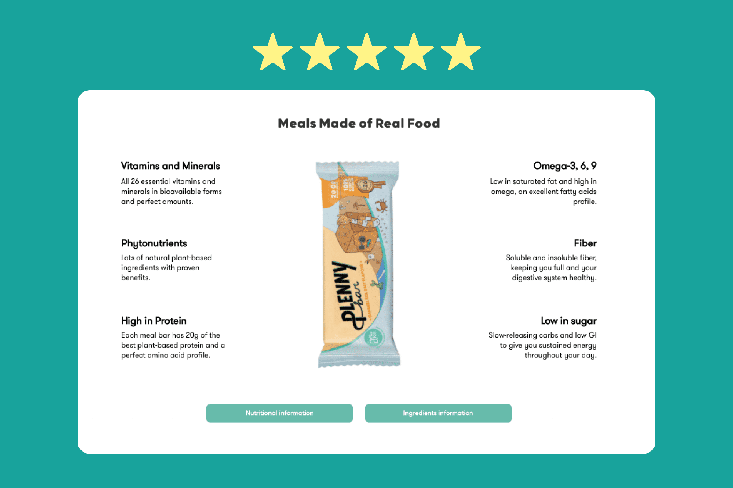
Table of Contents
Especially when it comes to spending money, we all want to trust that we are buying the right things. Whether it's at the grocery store or shopping online, many consumers do their due diligence, ensuring the products they buy are exactly what they need in terms of look, size, function, fashion, usability, sustainability, and the list goes on.
That’s why for businesses, especially eCommerce ones, it’s important to project transparency. After all, you don’t want potential buyers feeling like you are hiding things from them.
One central place to build this trust is the product page. By making your product pages as detailed and informative as possible, consumer trust, and business sales, can increase. We’ll show you how, and hopefully eliminate any indecisive “Add to Cart” hoverers.
Why social proof on your product pages builds trust
According to reports by Edelman, the largest PR firm in the world, brand trust is indeed a crucial factor in buyer decision making. According to their 2020 brand trust report, brand trust remains the second most important purchasing factor when it comes to buying from a new brand or becoming a loyal customer. And yet, in 2020, only 46% of customers globally trusted the brands they used.
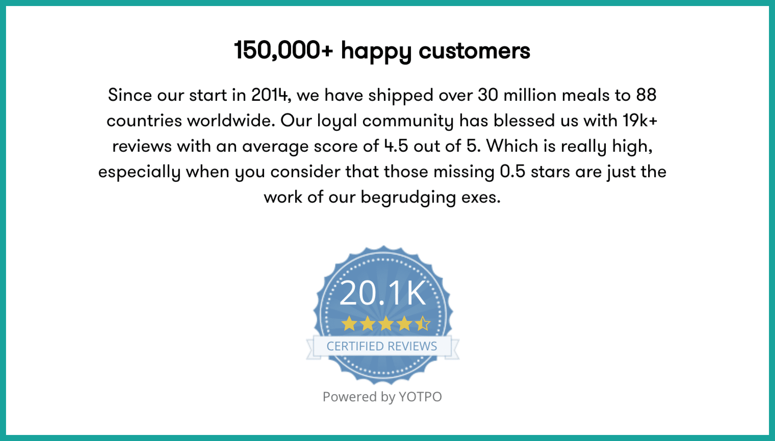
Jimmy Joy not only has customer reviews on each product page, but they also have a certification badge to ensure the reviews are all legitimate. They also add in some humour while they're at it.
With brand trust and brand sales inherently linked like this, boosting trust between your brand and potential buyers is paramount. One of the best ways to do this is by incorporating social proof into all your product pages.
Some examples of social proof include:
- Written reviews
- Customer photos
- Testimonials
- Social media links
Basically anything that links to a voice outside of your own. Including social proof is so important because people trust other people much more than they trust brands, companies, and conglomerates.
According to research by Bright Local, 79% of consumers trust online reviews “as much as personal recommendations from friends or family,” making social proof an extremely powerful way to build trust.
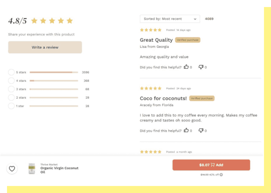
eCommerce grocer Thrive Market has a full customer review section for each one of its many product pages.
With this much weight placed into social proof, any business looking to succeed should look to bolster their social proof ASAP. By adding elements like customer reviews, name-brand testimonials, or even social media shoutouts, potential customers can feel much more confident in their decision to buy.
Make your product pages informational hubs
Potential customers want to know what they are spending their money on. They want more than a name and a sales pitch, give them the nitty-gritty details. Looking again at Edelman’s 2020 Brand Trust Report, 82% of buyers rate product ingredients as important to their buying decision, with other adjacent attributes like environmental impact and supply chain rated at 71% and 79% respectively.
Keeping that in mind, the best way to create that brand trust is with informative, detailed product pages. A great goal is to have everything a shopper needs to know about a product on a single product page.
The easiest place to start is with technical information about the product. Try to include detailed breakdowns of things like product materials, origin, dimensions, uses, potential benefits, and more, depending on the product.
Keep in mind that some products require unique information. For example, food products require nutritional information, an air conditioner requires details regarding cooling power, and so on.
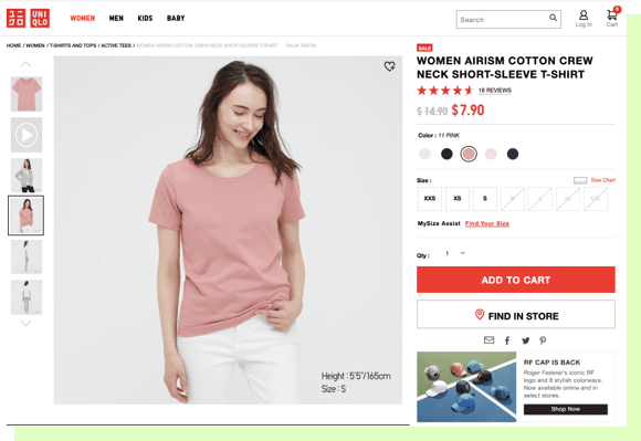
Another high-value inclusion to boost buyer trust is visual information. High-quality photos or videos give potential buyers a much clearer idea of what they are getting. This is especially pertinent with inherently visual products.
Take international fashion megabrand Uniqlo, for example. Uniqlo’s website does a great job of including visual information, with high quality, multi-angle clothing photography, often showing off multiple colourways on multiple models.
Keep the details on one page
If you’ve created a transparent, trustworthy product page, a potential buyer shouldn’t have to click away from that page to make their informed purchasing decision. Many brands miss this, putting essential information like shipping and return policies elsewhere on their storefront. While it sounds minor, this can strongly reduce sales. According to 2021 data gathered by the Baymard Institute, 49% of e-commerce shoppers abandon their cart before checkout due to extra costs that were not included in the product page, such as shipping costs. Unsatisfactory return policies make up another 11% of checkout abandonments.
Don’t let a final bevvy of information about shipping fees, taxes, and return policies ruin a nearly completed sale. Instead, include as much of this info as possible on the product page.
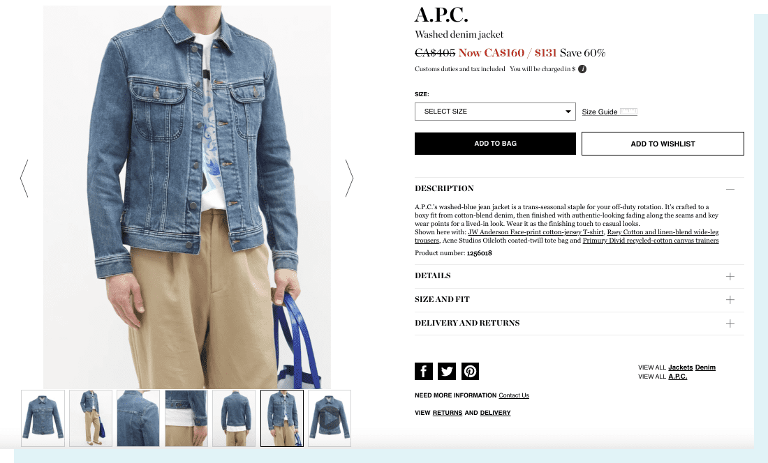
Try including dropdown menus on all product pages for information regarding shipping, returns, and even sizing. The luxury fashion brand Matches Fashion, for example, organizes all of its product page details, including sizing, shipping, and return info, into neat dropdowns.
Build a trusted brand, and make more sales
Making your product pages more informative and transparent naturally leads to more trust between you and your customers. By incorporating elements like social proof, technical information, visual information, and dropdown policy info, you are increasing transparency and allowing a trusting exchange between buyer and seller.
The data shows that consumers buy from brands they trust. With these intuitive product page changes, you can become one of those special, trusted brands.
Want to improve your data request processes? We’d love to help.
Harry R.
