The Best Cookie Banner Examples We've Seen (Updated!)
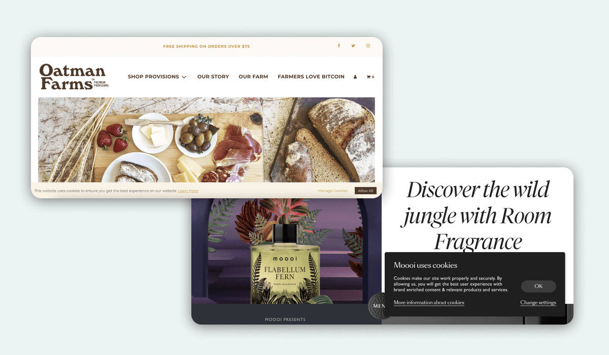
Table of Contents
Cookie banners are everywhere, thanks to European Union privacy laws like the ePrivacy Directive (“Cookie Law”) and the General Data Protection Regulation (GDPR). These privacy-focused laws give users more rights and control over how their personal data is used — including how websites use cookies that collect this data.
Privacy laws like the GDPR require businesses to have cookie banners that describe how they collect, store, and process data. All the cookie banner examples below are automatically GDPR-compliant, since they fill a crucial requirement of the law.
In this guide, we’ll take a look at different types of cookie consent banners, what makes them great, and examples of the best GDPR cookie consent banners.
Different Types of Cookie Consent Banners
Not every cookie consent notice looks the same. Different companies opt for other ways to let their visitors know about cookie usage.
Let’s take a look at some of this site uses cookies message examples, including the different types of cookie consent banners.
Footer Cookie Banner

One of the most popular places to display your cookie banner is in the footer of your homepage. This means it’s not taking up valuable real estate where the site visitor’s eyes land, but is still easily accessible and highly visible.
Footer cookie banners are favored for the way they don’t obstruct a user’s view when they first land on your webpage. This means they get the chance to see what’s on your homepage, then provide their consent for cookies before they explore further. This style of cookie banner is popular with retailers because they can still use the rest of the screen area to tempt you into wanting their new product or promotion.
People are used to looking at a website’s footer for key information like contact details, opening times, and privacy policies — so having your cookie consent banner here makes a lot of sense. It gives your visitor one place to look for all the privacy and compliance information they need.
While footer cookie banners are highly popular, they’re used and styled very differently depending on the website. Some prefer a full width banner with only an “Accept” button alongside a cookie notice, while others offer a footer box with options to customize your cookie preferences.
Popup Cookie Banner

Another popular type of eCommerce cookie banner is the popup or modal box. This cookie consent notice commands your attention as soon as you land on a website for the first time, and is often centered on the screen for maximum impact.
Popup or modal cookie banners make your user’s choice over consent even more obvious than a footer banner. They’re forced to make a decision before they can move on and explore your content. This means it’s a good choice if you want to obtain explicit consent from all of your website visitors.

Some websites — like YouTube — have taken the popup cookie banner a step further and introduced a full page notice, or a “cookie wall”. This blocks you from seeing the website’s content completely until you’ve given consent for cookies, denied consent, or adjusted your preferences. This is an option for the ultra privacy-conscious websites, but for many, a popup that only slightly obscures your content works great.
Many popup cookie banners feature a range of customization options for users that want to set their own preferences. They often allow users to do this within the widget, so they don’t need to visit a separate page. For some users this is appreciated, but others may find the experience of being faced with so many options on their first visit a little overwhelming. Nonetheless, we find this type of pop ups appear pretty regularly and is a popular choice, to boot.
Top Header Cookie Banner

While footer cookie banners and popups are more commonly used, there is another place you can find a cookie consent notice — within a website’s header. This puts the cookie banner right next to the header navigation, so is a great option if that’s where your users spend most of their time.
Header cookie banners are easy to miss, which is why so many websites opt for a more obvious placement instead. They can work well for news driven websites though, as your eyes are often drawn to the top of the page to navigate to a category that interests you. They’re also a good option if you want a more clutter-free appearance on your homepage.
A disadvantage to using a header cookie banner is that it disappears from view when a user scrolls down. This means they can continue browsing your website uninterrupted, but it also means you haven’t secured their explicit consent — so you would lose out on serving valuable analytics or advertising cookies to them.
The Best Cookie Consent Examples
Knowing what makes a cookie banner great helps you craft your own, but seeing cookie consent examples can be even more useful if you’re a visual person. Here are some of the best GDPR cookie banner examples we’ve seen this year.
1. Google's Cookie Banner

When a website visitor lands on a Google search page for the first time, they’re presented with this large pop up cookie consent banner. What’s great about this cookie banner is that it matches Google’s branding perfectly. There’s no mistaking that signature logo, colors, and illustration style. Using your branding to personalize your consent banner is a great way to make it feel truly intentional and designed.
2. Planable
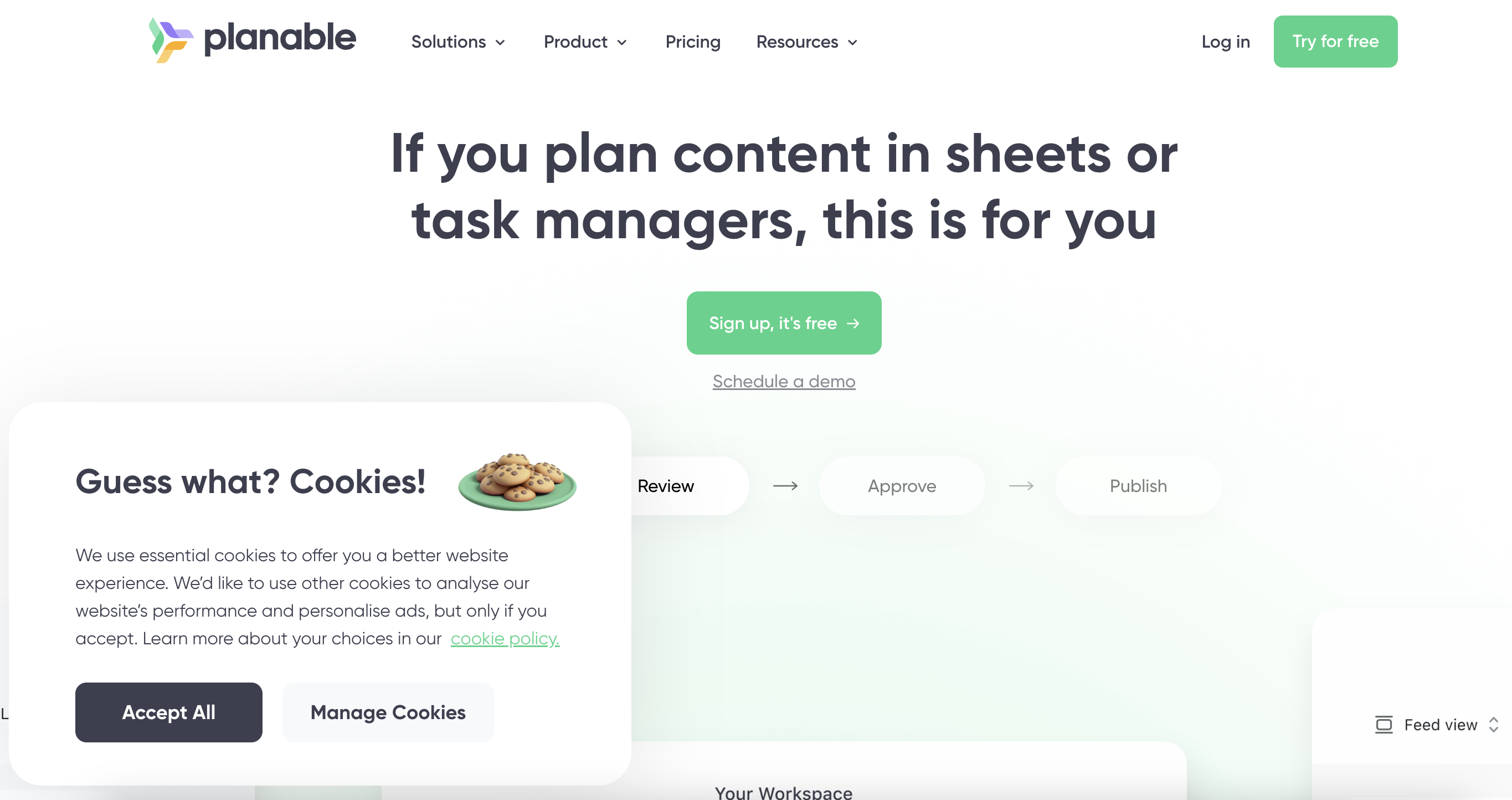
Planable's cookie banner is vivid, refreshing, and emblematic of its brand identity that's both fresh and vibrant. The banner is an example of all you can achieve with Enzuzo's consent manager — the dev team applied custom CSS to make the popup blend in seamlessly with the website and give it a touch of humour.
Overall, it looks great and maintains Planable's brand identity across its digital portfolio — we bet the product marketing team is happy.
👉 Planable used Enzuzo to build its cookie consent banner. Generate one like it for free
3. New Balance

Sneaker company New Balance also opted for a modal popup banner, but this time it’s smaller and more simple. We love the direct and encouraging title on this one, and that it’s backed up in reality by the option for users to manage their own cookie usage settings. There’s also very little color difference in the two button options, giving the impression that they’re not leading you in one direction or another.
4. Glossier

Cosmetics brand Glossier has injected some of their personality into their cookie banner — kicking off with a casual “Hi!”. This is a great way to engage with your audience instantly, and can work really well if you have a notable brand personality or style. There’s also an opportunity for users to visit their dedicated cookie policy, helpfully highlighted in a bright blue hue. Glossier's attempt is an example of banners and popups e-commerce — since it's a large cosmetics company that's serving global consumers.
5. Revo

Sunglasses brand Revo has chosen a pop up cookie consent notice for their website. What’s great about this banner is that it clearly sets out what different cookies are used for, without being overwhelming. There’s also a one-click button that people can use to consent to only essential cookies — which is often a lot of people’s preference. This button makes that fast and easy to do, and shows respect for their users’ time.
6. Tails

On the surface, this cookie banner from dog food brand Tails doesn’t seem like anything out of the ordinary. It offers users the option to allow all cookies, or manage their preferences. But look closer and there’s a small but mighty reference to the reason the user is here — their dog. It’s subtle, but it’s a great way to personalize the experience.
7. Gamestop

Gamestop has taken their cookie banner in a different direction, requiring users to personalize their cookie consent management and ad experience from the start. This is a departure from most websites’ desire to simply have someone click “Accept” and move on. Gamestop also gives users an easy way to opt out of “sale” of data, as part of requirements set out by the California Consumer Privacy Act (CCPA).
8. Burger King
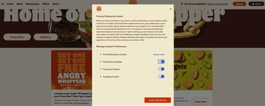
We like Burger King's cookie banner example since it's on brand, visually appealing, and covers all the necessary details required under the privacy policy. You're able to select consent preferences and opt out of certain targeting options if you prefer.
9. UEFA
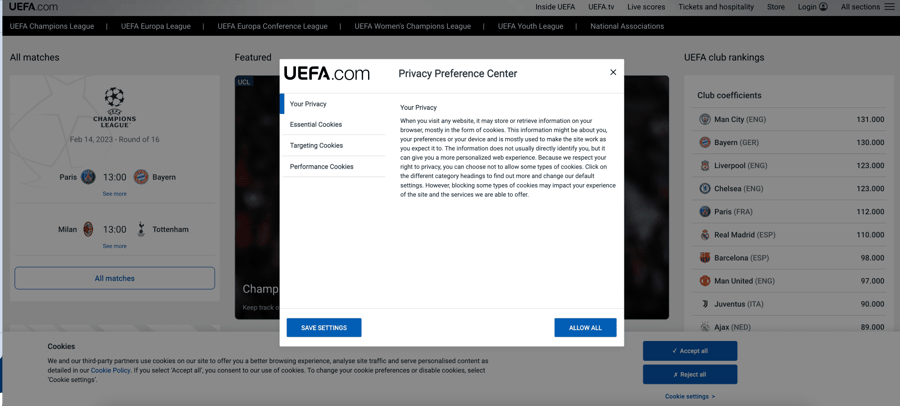
UEFA is the governing body of European soccer, so you can be sure that its cookie banner is GDPR compliant. The cookie consent banner itself is fairly minimalistic, but it blends pretty smoothly with the site without interrupting the user experience.
10. Lufthansa
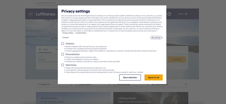
Lufthansa is the state airline for Germany, so you can be sure that its cookie consent banner is both GDPR compliant and detailed. We're fans of the beautiful font and user experience as well as clear explainer text that goes into detail about what data is collected. This cookie consent message example is robust and packs a punch.
11. FIFA
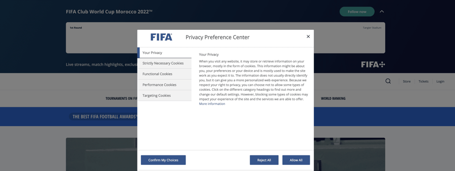
FIFA is the global soccer governing body, including some jurisdiction over Europe. Its cookie consent popup is simple, effective, and gets the job done. The UX is similar to UEFA's cookie banner example, but we're not complaining.
12. McDonald's
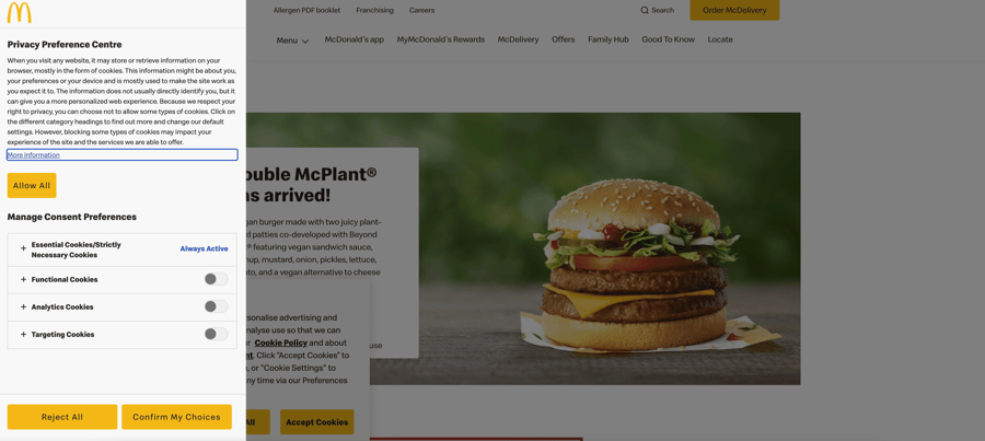
I'm lovin it! The McDonald's cookie banner rounds up our list of the best GDPR cookie banner examples but oh my is it a beaut! It opens up on the top left of your screen, has beautiful brand alignment, and is just a stellar experience overall. We love that you can keep your eyes on the prize — the McDouble in this case, while continuing to read your data rights if so inclined.
13. Enzuzo
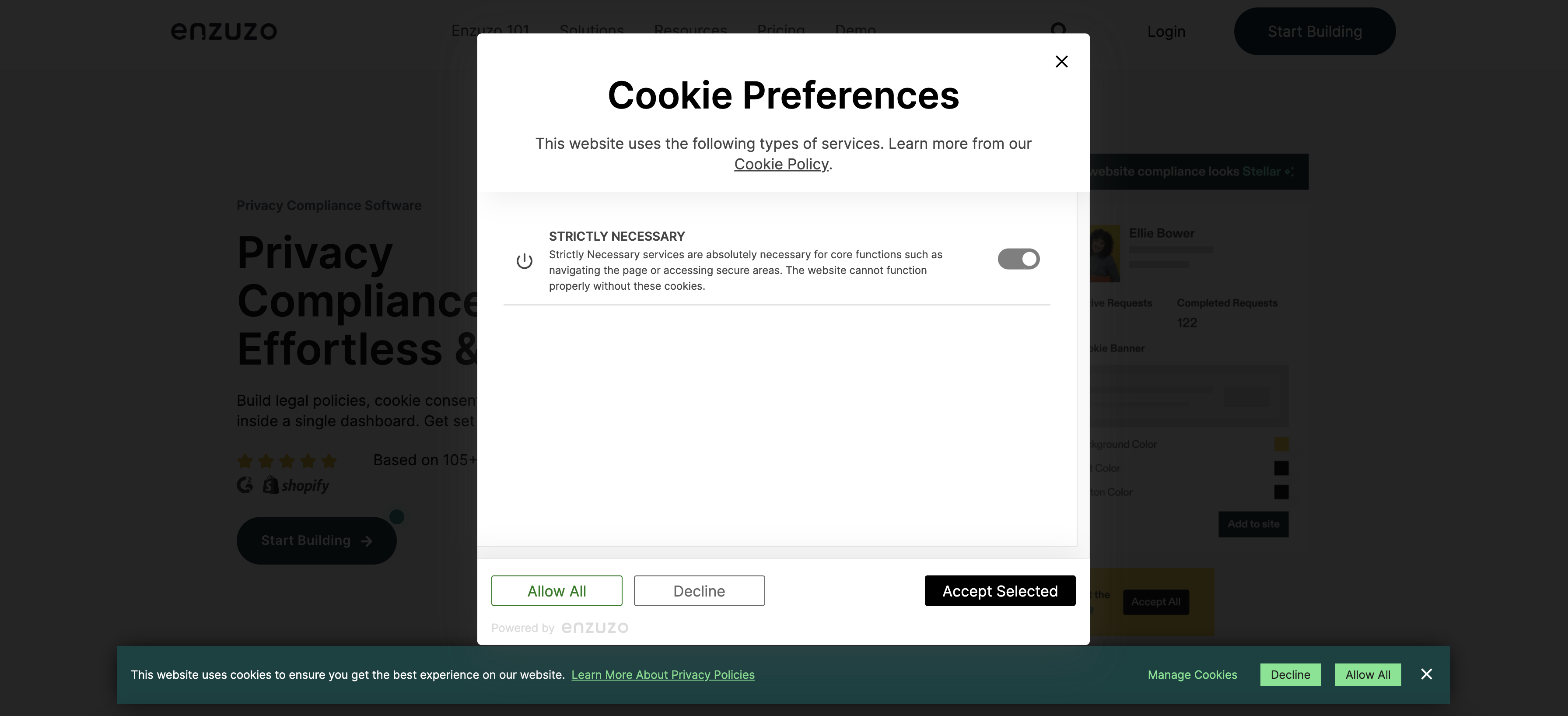
We're not ones to toot our own horn, but Enzuzo's cookie consent banner can be styled to meet your brand requirements and is 100% compliant with all relevant data privacy laws. What's more, it's totally free to get started. Now that's something we can get behind.
14. Klayvio
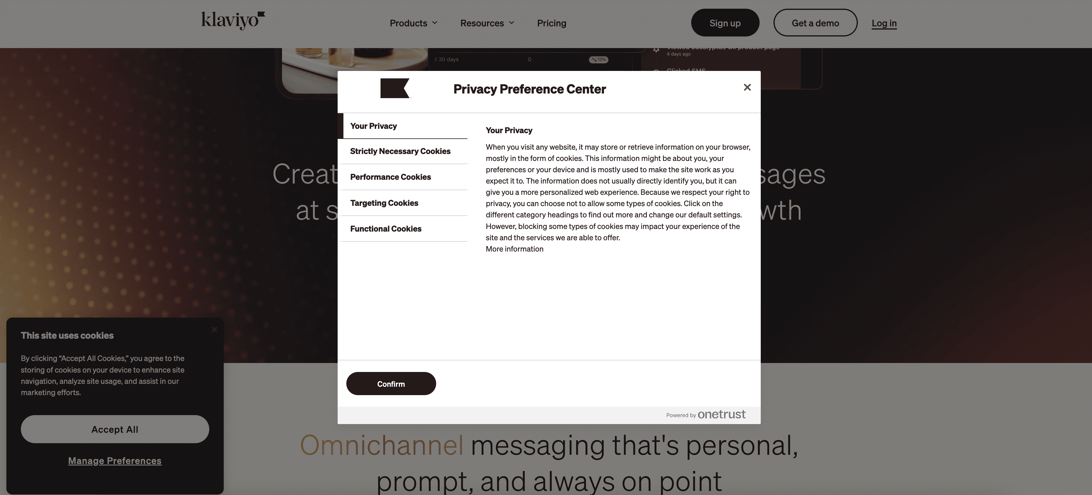
Email marketing tool Klayvio stores a ton of personally identifiable information, so it's good to see that its cookie consent banner is neatly formatted and covers the essentials. While it doesn't pop like some of the other examples on this list, it's functional and gets the job done.
15. American Airlines
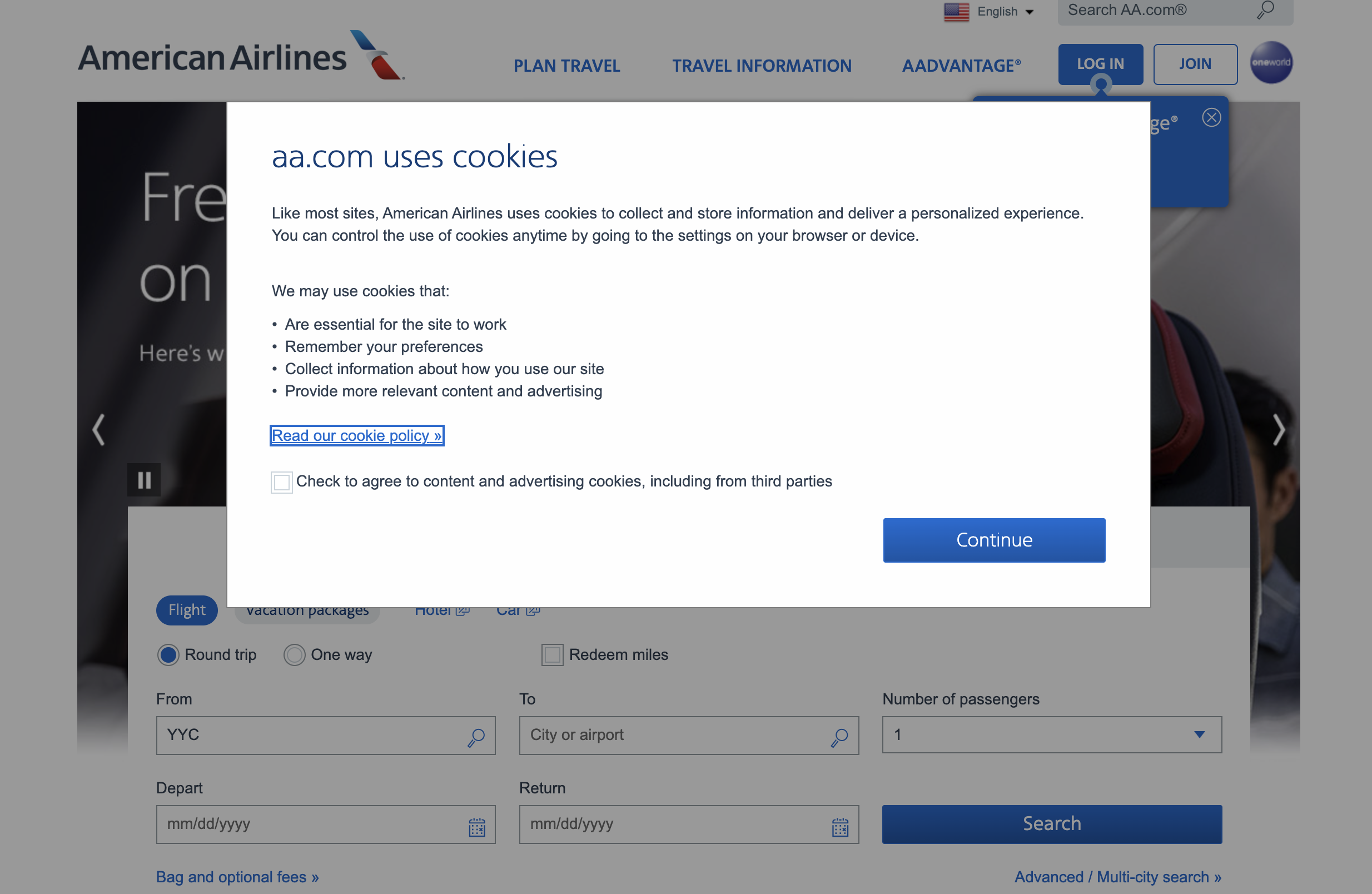
The American Airlines cookie banner comes in a popup style format rather than a banner at the bottom. We like that it offers a clear call to action to read the entire cookie policy and it doesn't overwhelm the reader with too much text. It's minimalism at its finest.
What To Include in Cookie Banner Text
The cookie message examples listed above have a combination of great design, non-intrusive placement, and the right text. So how do you come up with your own? Some parts are essential, of course, such as privacy information and such. Beyond that, there are a few ways to stand out. Let's dive in:
Clear and Obvious
The best cookie consent banners are clear and obvious as soon as someone lands on your webpage. There’s no mistaking that a user has a choice over which cookies are displayed to them, and they’re given the opportunity to give their consent through an opt in method. These banners put the user’s consent front and center, and aren’t hidden away behind other popups or features.
Styled to Match the Website
Cookie banners need functionality like buttons and links to work, but the very best ones also look beyond that and consider style too. A cookie consent banner that fits in with your brand — in terms of colors, fonts, and language — feels more personal and intentional than one that hasn’t been customized at all.
Informative and User Friendly
When it comes to different pop ups, such as exit pop ups and display pop ups, we believe it's vital to go the extra mile to be user-friendly. It’s easy to do the bare minimum when it comes to privacy compliance, but putting in extra effort to make the user experience better sets the best companies apart. Use clear language, easy-to-read fonts, and give people choice over what happens with their personal data through the ability to set cookie preferences.
An Easy Way to Manage Cookie Banners and Data Privacy
Designing your own compliant cookie banner doesn’t have to be challenging or expensive. With Enzuzo, you can use our simple tool to help you build and customize a cookie consent banner for your website, ecommerce store, or Shopify site.
Use the template banner provided and personalize it with your own wording, colors, fonts, and styles to make it feel like it’s uniquely tied to your brand. Take that user experience even further, with the opportunity for users to set their own consent preferences built in. This means you can show your users that you’re privacy conscious and care about their choices with no extra effort.
With a customized cookie consent banner, you’re on your way to staying compliant with key privacy legislation. It doesn’t start and end there though. When it comes to linking out to your privacy policy, our privacy platform also features a tool to help you build and display a user friendly policy that people can easily make subject access requests through. With your privacy policy, cookie banner, and user requests all handled in one place, it’s easier than before to manage your data privacy compliance.
👉 Looking for more inspiration? Check out our list of the best privacy policy examples.

Osman Husain
Osman is the content lead at Enzuzo. He has a background in data privacy management via a two-year role at ExpressVPN and extensive freelance work with cybersecurity and blockchain companies. Osman also holds an MBA from the Toronto Metropolitan University.
